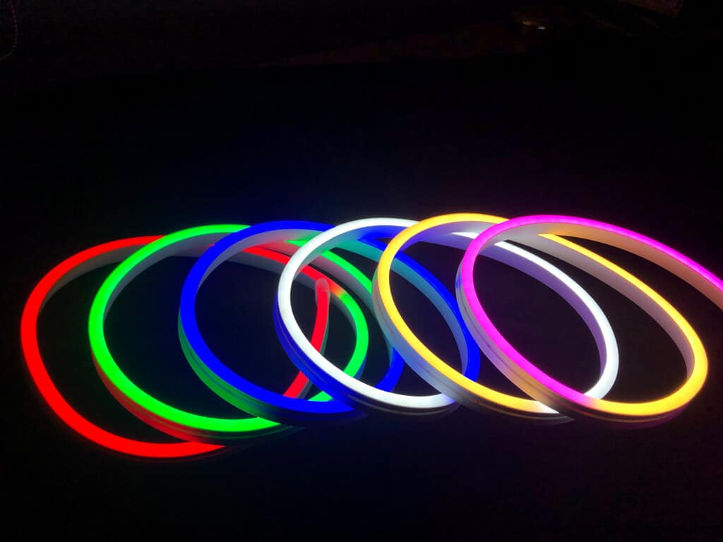

Color is one of the most powerful elements in visual design, especially when it comes to lighting. In modern interior décor, branding, and event design, LED neon lighting has become a popular way to create atmosphere, attract attention, and express identity. However, the effectiveness of neon lighting depends heavily on one critical factor: color choice.
Different colors can completely change how a space feels, how a message is perceived, and how strong the visual impact of a design becomes. This is why understanding color psychology and application is essential when working with neon lighting.
Designers, businesses, and homeowners increasingly rely on custom led neon lights because they allow full control over color selection, enabling highly personalized and visually effective lighting designs.
The Role of Color in LED Neon Design
Color in neon lighting is not just decorative—it directly influences mood, visibility, and emotional response. A single design can feel completely different depending on the color used.
For example, a quote in warm white may feel elegant and calm, while the same quote in bright red may feel bold and energetic. This flexibility makes LED neon lighting a powerful tool for both aesthetic and functional purposes.
Color also affects readability and contrast, especially in complex environments such as retail spaces, photography studios, or event venues.
Warm Colors and Their Visual Impact
Warm colors include shades like red, orange, pink, and warm white. These colors are commonly used in environments where comfort, intimacy, or excitement is desired.
Emotional and Visual Effects
Warm neon colors tend to create a welcoming and cozy atmosphere. They are often associated with passion, energy, and creativity.
Common Uses
- Restaurants and cafés
- Bedroom and home décor
- Romantic event setups
- Retail displays with emotional branding
Warm tones are especially effective in spaces designed for social interaction or relaxation.
Cool Colors and Their Aesthetic Value
Cool colors such as blue, green, and icy white create a different visual experience. They are often associated with calmness, professionalism, and modernity.
Emotional and Visual Effects
Cool neon lighting tends to feel clean, futuristic, and soothing. It can also enhance focus and clarity in work environments.
Common Uses
- Corporate offices and workspaces
- Gaming setups and studios
- Technology-related branding
- Minimalist interior designs
Cool tones are widely used in modern commercial environments due to their sleek and professional appearance.
Bright and Bold Colors for High Impact
Bright neon colors like neon green, electric blue, and vibrant red are used when maximum visibility and attention are required.
These colors are highly effective in environments where signage needs to stand out quickly.
Common Uses
- Storefront signage
- Event promotions
- Nightlife venues
- Advertising displays
Bold colors are often used in competitive visual environments where capturing attention is the primary goal.
How Color Affects Branding and Marketing
In commercial design, color is directly tied to brand identity. Businesses carefully select neon colors to reflect their personality, values, and target audience.
For example, luxury brands may prefer soft white or gold tones, while entertainment venues may use bold and colorful combinations.
Color consistency across signage and branding materials helps reinforce recognition and trust among customers.
The Importance of Contrast and Background Balance
Color effectiveness in LED neon lighting is not only about the neon itself but also about how it interacts with the surrounding environment.
High contrast between the neon color and background surface improves visibility and readability. For example, bright neon on dark walls creates a strong visual impact, while soft tones on light backgrounds produce a subtle and elegant effect.
Designers often test different combinations to achieve the right balance between visibility and aesthetic harmony.
Psychological Influence of Neon Colors
Color psychology plays a significant role in how people perceive neon lighting.
- Red can evoke excitement, urgency, or passion
- Blue often represents calmness, trust, and professionalism
- Green is associated with freshness, balance, and nature
- Pink conveys softness, creativity, and romance
- White represents simplicity, cleanliness, and elegance
Understanding these associations helps in selecting the right neon color for specific environments and goals.
Customization and Creative Freedom in Color Selection
One of the biggest advantages of modern LED neon lighting is the ability to fully customize colors. This allows users to align lighting designs with personal preferences, branding guidelines, or thematic requirements.
With advanced LED technology, even gradient and multi-color effects are possible, offering greater creative flexibility than traditional neon systems.
This level of customization ensures that every installation can be unique and purpose-driven.
Conclusion
Color choice plays a crucial role in determining the effectiveness and visual impact of LED neon lighting. It influences mood, branding, visibility, and overall design quality across different environments.
Whether used for home décor, business signage, or event installations, selecting the right color can significantly enhance the final result.
With the flexibility offered by modern LED technology, users can fully customize neon lighting to match their creative vision and functional needs, making it a powerful tool in contemporary visual design.